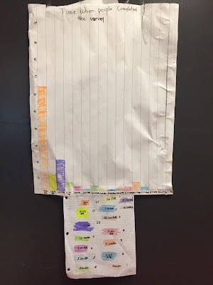
Regarding TIME:
(Brenley, Cameron, Katherine & John)Looking at the graphed data, we can see that most people responded to the survey at 9am.
The least common times to do the survey were: 1pm, 11am, 5pm, 2pm.
We think this is because people check their social media sites before going to work, school, etc.
The second most common time to complete the survey was 11pm. This would be a common time because people might be checking their social media sites before bed time.
(Teacher's note: This group had an extra task. The data collected by the google form was time stamped in 24 hr clock time. They had to work with the data and translate it to regular time for their graph. Great math learning!)
Where do people live?
(Larissa, Dylan, Adara, Taylor)
This graph shows where people answered the survey from. There are 4 categories:
- I was born and raised in Canada.
- I live outside of Canada.
- I immigrated to Canada.
- None. (Note: This category had to be added because we came across one survey response with NO data here.)
We recorded 31 responses from the data sheets we had. We decided to have a scale of 10 because we had a really high number for one of the groups. Thus, we played on the calculator to figure out which grouping / division would have the least left over.
26 people living outside completed our survey (base don the data sheets our group worked with).
What age groups filled out our survey?
(Joshua, Celine, David, Kelly, Karsyn, Olivea)
This graph shows the age groups and we did not have to include some of the age groups from our survey because no one in those groups completed our survey.
We tried making the graph, but at first we didn't know how, then we chose a scale of 5 for the graph.
We find it interesting that the largest number of respondents was 50-60 years old.
17-20 year olds were the lowest number of people (except for those that did not choose to do the survey).
A suggestion from a different member was to make their graph easier to read, perhaps the bar graph could have been drawn horizontally instead of vertically.
 |
| data as graphed from the Google Form |
 |
| data as graphed from the Google Form |
Thank you to everyone who participated! It was fun!


